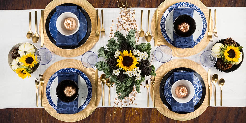
Pick Your Palette
So you’re designing this year’s fall table setting, and you need some ideas to make it unique. A color palette of red, orange, and yellow is dependable choice—those are the characteristic colors of autumn, bringing the changing leaves indoors for an energetic atmosphere. As an analogous color scheme (one made of hues found next to each other on the color wheel), it doesn’t clash and has a very harmonious look. But because this seasonal palette is so reliable, it’s been done before. A lot.
So how can you switch it up without losing that classic fall feeling? Here’s a simple solution: just add blue. Yes, blue. It’s more commonly associated with the cold, but its purpose is to provide contrast to the overwhelmingly warm. Blue is orange’s opposite on the color wheel, so the colors complement each other to form a striking and complex palette. It’s a level up from the simplicity of analogous colors, and this color scheme is known as accented analogous.

(From paletton.com)
If you’re feeling even more daring, set aside the idea of a “classic” fall table and bring in more blue than orange. It’s not really as weird as it sounds; blue is the world’s most popular color for a reason. It’s associated with a lot of positive traits, including trust, quality, and dependability, as well as natural beauty like the sea and sky. Maybe these concepts aren’t specific to autumn, but you can get creative to add that seasonal touch. And aside from being easy on the eyes, a blue dining room might help keep you from overeating at Thanksgiving dinner—the color suppresses appetite, unlike red and yellow.
Not convinced yet? Check out these fall table setting ideas featuring blue décor both as an accent and as a prominent part of the palette:


