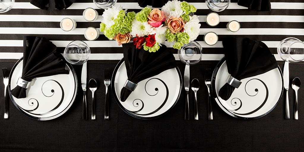
Set a Striking Table
When you hear “black and white,” you might think of a few different things, from newspapers to old movies to various moral and philosophical metaphors. But do you ever think about your table setting? If you’re brainstorming everyday dinner décor or even a wedding color scheme, you can get quite a memorable look when you start with monochromatic dinnerware.
But before getting into the whys and hows, let’s make sure we’re all on the same page with our terminology. There are a few ways to describe black and white images, though they don’t quite mean the same thing.
- Monochromatic: From the root words “one” and “color,” the monochrome definition is actually a bit broader than you might expect. It allows tints and shades of a single hue, meaning white or black mixed with another color on the color wheel.
- Achromatic: What most people think of as monochromatic can be more precisely defined as achromatic, without color. It’s limited to the basic black, white, and gray.
- Grayscale: As the name suggests, the only colors here are shades of gray, including white and black. And while anything grayscale is also achromatic, not all achromatic palettes are grayscale. Instead, some are…
- Binary: You might recognize this term from your computer classes. Here, it means two colors, with no shades in between, also known as bi-tonal. Like monochromatic, it commonly, though not exclusively, refers to black and white.
So, to be perfectly clear: when we said “monochromatic dinnerware,” we really meant “achromatic binary dinnerware.” Grayscale doesn’t have a place at this table; it bridges the gap between our two extremes and softens the entire look. When colors blend together, the effect is harmonious, but not the most exciting. A sharp contrast, on the other hand, makes you pay attention. It creates visual interest and drama, and no two colors show more contrast than black and white. They’re at opposite ends of a spectrum—even complementary colors are found on a wheel, connected on both sides. For a bold and striking impact, black and white designs are the perfect choice.
Now that you have your base, you can start thinking about the accents. Try adding a pop of bright color—alright, yes, we did say black and white patterns provide the best contrast, but this is the exception that proves the rule. As long as you don’t overpower your base colors, a high-saturation hue will draw the eye and work wonders in a centerpiece. We did promise you a memorable look, after all.
Zak Designs brings plenty of options to your table, but black and white leave a remarkable impression. Why don’t you see for yourself why these two colors are a classic combination?